
Overview
In transitioning from dentistry to design, nothing felt more fitting than creating a dental app to ease my everyday workflow. Through meticulous research and thoughtful design, I created a mobile app that redefines how patients interact with their dental appointments.
Role: Researcher, UX/UI Designer
Design Process: Double Diamond
Timeline: December 2022-July 2023
Problem
From financial and geographic factors to dental fears or a lack of personal accountability, there is a wide range of reasons why oral health is neglected. This leads to a huge burden of responsibility that lands on dental providers as patients show up for emergencies when they feel a toothache, which is often too late.
.png)
More than 40% of adults report pain in their mouth within the last year
.png)
One quarter of adults aged 20-64 have untreated cavities
.png)
4 in 10 adults aged 30+ have gum disease
.png)
>$45 billion is lost annually from dental emergencies requiring unplanned care
Source: CDC Oral Health Conditions
Knowing how under utilized technology is in our workflow, I began to consider the potential for a more effective means of fostering patient engagement with their oral health.
Objectives:
-
To connect patients with their dental office
-
To help patients achieve their dental goals
-
To create easy access to accurate oral health education
-
To increase preventable care
-
To decrease the burden of treatment on dental providers
Discover
First, I explored the challenges faced by other members of the team and validated the project with a qualitative survey of 10 staff members and patients.

Receptionist- "The schedule fills up fast but falls apart easily when the day gets close, then we have to call off the waitlist and not everyone answers"

Dental Assistant- "It’s sad to see patients come in with similar problems because they aren’t cleaning their teeth, I want to see them take charge of their oral health"

Dentist- "We don’t always have time to go over the details of all
treatment options"

Patient- “I want a dental clinic that understands my busy schedule. Flexible appointments and educational resources would make a huge difference for me"
I then mapped a service blueprint of our current workflow and noted where there were opportunity spaces that aligned with my project's objectives.
.png)
Service Blueprint
Define
After gaining insight from surveys and the service blueprint, I defined and constructed a user persona, Sarah, to represent patients who would use mobile devices in their day to day lives. I then deepened my empathy for this user's pain points through journey mapping.
.png)
.png)
Using this research, I defined 3 key problems and 3 key opportunities to address my user's interactions with their oral health and established a new problem statement to guide my designs.
Problem areas
-
Users find it challenging to schedule and reschedule appointments
-
Users desire more information about their treatment plans and practical instructions on improving oral health
-
Users, especially those with dental anxiety, want more information about their providers
Opportunities
-
Create a mobile application with the ability to schedule and reschedule appointments
-
Provide more accessible information on clinical procedures and at-home care so patients don't have to seek third party resources
-
Improve trust in clinic and providers with provider profiles
Here is a visual that summarizes the problems that could be distilled into a feasible product.
.png)
Design
I sketched an information architecture (IA) and created low and mid fidelity wireframes.
Information Architecture
.png)
Low fidelity wireframes

Mid fidelity wireframes

After multiple rounds of iterations, I conducted two usability tests to observe user interactions with the app and their understanding of its features, specifically testing the features that presented the biggest challenges: the motivational content, homepage confirmation button, and the treatment planning page. This feedback helped identify pain points with the designs and assess its quality and simplicity.
Initial iterations to explore design direction
My first usability test was conducted with a mid-fidelity wireframe, testing with 3 patients at my dental clinic that fit the demographic of our user. While participants generally had a positive reaction to the app, the users had a difficult time understanding some of its features.
Participants liked...
-
Personal, informative, motivational content
-
Multiple ways to access treatment plan
-
Treatment information prior to scheduling
Areas for improvement...
.png)
Design consideration #1
Motivational Content, personalized visualization of dental progress
I explored reducing visual real estate so the user can view upcoming appointments without scrolling. I also removed the quantification of user progress in response to the feedback that users were confused about how the number was measured.


Design consideration #2
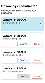
Confirmation button, take control of upcoming appointments
For upcoming appointments, I mocked up a few different ways users could confirm, reschedule, or cancel their appointments and decided to test a single confirmation button to improve the CTA. I also labeled upcoming appointments for the ones ready to be confirmed and future appointments for those not ready for confirmation to remove written instruction. Lastly, I added information about the provider and location on the home page to strengthen trust in the clinic-provider-patient relationship.


Design consideration #3
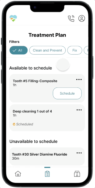
Treatment plan, a gateway to learn about and schedule treatment
On the treatment planning page, I removed the the image box because of unfamiliarity with an odontogram. Instead of enhancing user experience, it created confusion. I considered different menus for the different steps in a treatment plan and changed it to a filter menu to give more flexibility when viewing/navigating the plan. To increase accessibility and visibility of the scheduling button, I added "schedule" buttons on the treatment planning page.
_edited.jpg)


Applying the visual identity
Using my community clinic's colors, I created a style guide with a sans serif easy-to-read font.

High fidelity wireframes

Second round of iterations to polish design decisions
After applying the visual identity and design changes from the first usability test, I conducted a second usability test with 5 patients at my dental clinic that fit the demographic of our user to confirm that the changes made were effective.
.png)
Design consideration #1
Improving the motivational content
I maintained the reduced visual noise and real estate so the user can view upcoming appointments without scrolling and reintroduced a visual representation of progress for treatment, oral habits, and diet for more motivation.


Design consideration #2
Organizing the treatment plan for readability and scannability
Added the "all" filter button to view the entire treatment plan and created headers for available, unavailable, and completed treatments to allow for scannability of the treatment plan.


Deliver
Motivational Content

Confirmation Button
Treatment Plan

Clinic Info
Summary and next steps
This was a challenging and valuable project to utilize product design in a field that I am very familiar with. My biggest challenge throughout this project was around designing with clarity and simplicity. With a background in dentistry, I understood the complexities around dental care and knew what I wanted the app the achieve, but it was only through usability testing and feedback that I was able to design effectively for my unique patient population.
While there are still more opportunities to design (see below), next steps would involve connecting with a software developer to launch this product and partner with insurance companies to transfer API of patient insurance plans to address another key pain point for users.
More design opportunities
-
Onboarding pages and sign up screens, i.e. choose a dentist, add health history, sign forms
-
An account page for updating personal information
-
Insurance plan and fee schedules so prices can be personalized to address price transparency and increase patient trust
-
Connect with animation designers to create moments of joy and a robust gamification element


Check out my other projects

