
Overview
I rekindled my love for reading during the 2020 COVID-19 shutdown. Unable to check out books from the library, I discovered Libby, an app that bridges the gap of library resources with digital access. However, I found myself clicking the wrong icons prior to reaching the screen most important to me: the shelf, where my readable books were. I wondered, how could I take an app that I enjoy using and make it better?
Role: Researcher, UX/UI Designer
Design Process: Double Diamond
Timeline: February 2023-May 2023
Problem
Libby is a free, ethical, and convenient way to access library resources on the go. It is awarded for its easy to use reading/listening screens, but most users are not using it to its full capacity. The current iteration of the Libby app presents challenges arising from poor navigation, resulting in heightened human errors and a cluttered design. As a user myself, this prompted a redesign.
Objectives:
-
To increase time spent borrowing and reading/listening to books while reducing frustration and mistakes made in the process
-
To improve the UX/UI in a way that prompts users to explore more app functions
Current Design

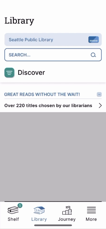
Discover
Libby is loved for its curated reading lists from local Librarians and boasts an Editor's Choice Award with 4.8/5 stars from 3 million apple store reviews. First, to validate the need for a redesign, I gathered qualitative data from existing 1 star apple store reviews to explore challenges users currently face.

Next, through an analysis of direct competitors (Audible, Kindle, Apple Books, and Cloud Library), I found that compared to its retail counterparts, Libby focuses on discovery of books.
Competitive Analysis
.jpg)
Lastly, I completed a heuristic evaluation to identify key problems and find improvement opportunities.
Heuristic Evaluation

Define
After the discovery phase, I identified a user persona, Polly, to represent individuals who utilize Libby to explore titles and read books they check out. Through journey mapping, this user persona helped me define the needs and preferences of Libby's target audience.
.png)
.png)
By empathizing with and defining the user, I explored different pain points and opportunities, and ultimately identified 4 key problem areas and 4 key opportunities to address in my redesign.
Problem areas
-
Navigation structure- without labels or recognition icons, there is confusion and inefficiency for users trying to find the books they are reading
-
Functionality of features- pages such as the homepage, timeline, and filter system clutter the app
-
Wait times- users are frustrated by the waiting period for checking out books
-
User interface- alignment, buttons, and use of color negatively impact overall design quality
Opportunities
-
Update the architecture framework, label navigation icons and clean up UX by reducing number of icons
-
Redesign a filter system and reading journeys to be easy to find and familiar for users
-
Give opportunity to add libraries and toggle between searching and checking out books from multiple libraries
-
Improve overall UI
Design
Since users had trouble navigating through the current app, I started the redesign by rebuilding the current Information Architecture (IA) to understand its structure and explore its features.
Current IA
.png)
I mapped out a new IA that opens directly to the Shelf, the app's most important feature, and simplified the overall navigation throughout the app. I used this IA to create low fidelity wireframes.
Revised IA
.png)
Low fidelity wireframes

Applying the visual identity
Libby has an strong existing brand identity, so I chose to use the same fonts, colors, and icon design for the style guide. Additionally, I improved the UI concerns that were found during my heuristic evaluation to create a more visually appealing product.

Mid Fidelity Wireframes

Validating the design changes
I introduced a new bottom navigation bar, redesigned the notification center, changed how users interacted with their saved libraries, and updated the filter page. I tested these changes with the two usability tests.
Design consideration #1
Navigation bar, know what to click
Updating the navigation was a low hanging fruit change. To address the greatest pain point discovered during qualitative surveys, I clarified the lower navigation in four ways:
-
Labeled and rearranged the icons
-
Combined the search function with the library page
-
Divided the home page into the personalized shelf and more settings
-
Turned the timeline into a journey page to incorporate more motivational features
Original

Redesign

Design consideration #2
Notification center, never lose track of updates
With a user that prioritizes reading over discovery, the shelf replaced the home page. With this change, the notification center was moved to the shelf as well. From the first round of testing, users found the notification center to be useful, but distracting even with ability to minimize the notifications. With this feedback, I created a new page for the notification center and combined it with the original timeline feature. User testing showed a preference and faster understanding for this design modification.
Original

Iteration 1

Iteration 2

Design consideration #3
Library card toggle, easy to change database for shorter wait times
To address was long wait times for books, I simplified the process of placing multiple holds with more than one library card. From the first round of testing, users found the drop down toggle easy to find and use in comparison to the previous cluttered bottom sheet, however, they felt that it could be further simplified. With this feedback, I reduced the toggle button to an arrow located to the right of the library title. This choice was validated in the second round testing through A/B testing.
Original

Iteration 1
Iteration 2

Design consideration #4
Filter System, a familiar way to discover new books
Libby's current filter system is less intuitive to users because its hamburger button and the design feel scattered. To reduce clutter and increase clarity, I simplified the design by removing the additional filter buttons and redesigning filter page.
Original

Redesign

Deliver
Summary
Redesigning Libby was a fun project where I took a well loved product and made it more user friendly. With this redesign, users won’t get lost while trying to access their books, and unlocks an efficient way for users to interact with its features. Through this project, I learned how both framework and minor design choices contribute to user error, and how to successfully fix them. While success of the design choices were confirmed during user testing, app reviews and quantitative tests could be conducted to further measure success.


Check out my other projects
.png)
